WELCOME TO VAGABOND GEOLOGY WHERE GEOLOGY ROCKS!
US ENERGY OVERVIEW
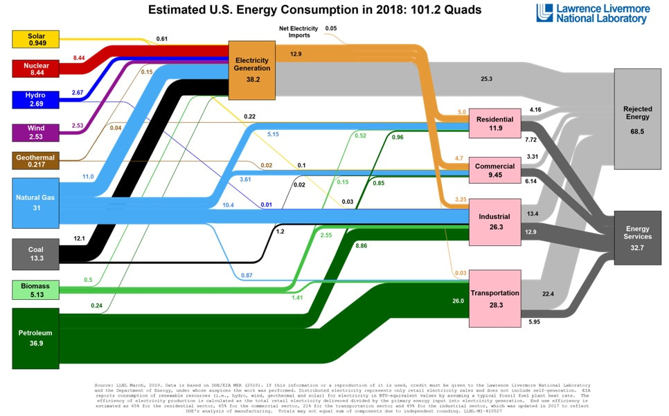
The Lawrence Livermore National Laboratory generates an excellent chart each year that summarizes, at a big picture level, all the sources and all the uses of energy generated in the US. The 2018 chart looks like this...
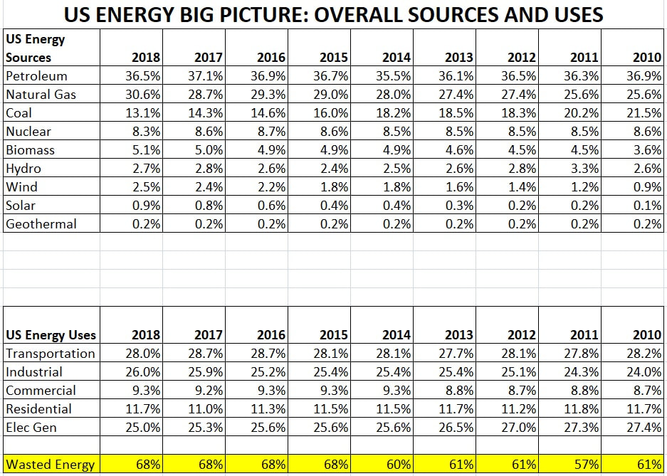
I've downloaded all the charts from 2010, put them into an excel spreadsheet and then summarized each chart in a table in that spreadsheet. Sheet 1 of my spreadsheet is a summary table of the other data tables. My Summary sheet, shown below, gives a quick overview of the sources and uses of energy in America.
I'd like to draw your attention to 4 points:
1) The contribution of coal to our energy mix is on a steady decline
2) The contribution of natural gas is on a steady increase as more and more coal fired energy plants convert to natural gas
3) The contribution of solar and wind, although on a steady increase, still contributes less than 3.5% of our energy needs
4) This is the most important point: 68% of all US energy supplied is shown as "Rejected" that means it is not put to use...it is "wasted." How is it "wasted?" - it either goes out the exhaust of car/trucks/trains, up the smoke stack of industrial plants, up the vent stack on homes and businesses, or is lost as heat from the wires of the nation's electrical grid system. If we could just refocus the scientific talent of America on this one issue, and maybe reduce this waste by 10%, it would be MAJOR!
My complete table is available for download below.
| us_energy_sources_uses.xlsx | |
| File Size: | 3070 kb |
| File Type: | xlsx |

